It is a distinct characteristic of British domestic architecture that hardly any houses, either historic or recent, are built with any sheltered outdoor space. There is usually a small front porch, but other than that the relationship between inside and outside is black and white - you are either in the house or in the garden. It seems strange in a wet and changeable climate not to have any other covered outdoor space.
Verandas appear on some late-Victorian and Edwardian houses, influenced by colonial architecture, and some 1960s houses had carports rather than garages, but these are exceptions. In some countries with equally inclement climates there are strong traditions of covered outdoor spaces. Traditional Japanese buildings for example, have engawa (verandas) around the perimeter which allow the buildings walls to remain open in rain or sun without getting to hot or too wet.
The examples above and below are from the Berner Oberland in Switzerland, around a village called Diemtigen. Almost every building has a big projecting roof that shelters spaces for various uses below the eaves. There are spaces for eating outside, for drying washing, for wood storage, and just for surveying the landscape. Some parts are glazed on one or more sides as shelter from the wind. Some are porches, opening directly on to the road. In the older farm houses, people, animals and storage are still housed under the same roof. I love the huge roofs and the way the outdoor spaces vary in scale and intimacy around the buildings, adjusting to the fall of the land and the changing functions on different sides. The main south facing elevations are homely and sometimes elaborately decorated, a deliberate display of wealth, whereas the agricultural ends are functional, even crude.
The scale, function and openness of the elevations varies, all under the same roof and within the same palette of materials. Our Dundon Passivhaus project was strongly influenced by Alpine houses like these. On three sides the roof projects beyond the walls, supported on an out-rigger structure of oak posts that loosely define sheltered outdoor spaces. The house seems to sit within a bigger sheltered domain that mediates between inside and outside.
On the north-east side the roof projections form a porch over the entrance and a carport. On the south-east and south-west sides they provide solar shading to the large areas of glazing, crucial in a highly insulated house to prevent summer over-heating. Each space has a different micro-climate depending on its orientation to the sun and wind. On the south-east side, sheltered from the prevailing wind, the temperature can be several degrees warmer than the surrounding air, extending the period of the year when we can sit outside. The verandas are partly there for functional reasons but there is much more to them than that.
The posts add a foreground to the view, framing certain features and introducing a play of light and shadow. The posts and beams have a satisfying structural clarity that isn’t possible in the main body of the house where the elements doing the structural work are covered by insulation and fire protection. There is something about being able to survey the landscape with a solid wall to your back that engenders a feeling of security and well-being. You are protected somewhat from the rain and from the direct heat of the sun while still enjoying fresh air and a direct engagement with nature.
The first floor loggia outside the kitchen is one of my favourite spaces. It provides a place to sit outside, to grow herbs and for children to play where we can keep an eye on them. The roof height rises from 2.4m to 4m, so it has a dramatic scale that relates both to the interior and to the wider landscape. It is both monumental and intimate, qualities which are difficult to achieve together.
So why aren’t spaces like these more common in Britain? An economic explanation is that on typical small plots, developers and volume house builders would rather spend money on indoor floor area to maximise profit and there is neither the space nor the budget for non-essential add-ons. Most urban and sub-urban housing in the UK has been built this way for centuries.
I suspect the reasons are also cultural. If people valued such spaces, and were able and willing to pay for them, they would demand them and developers would provide them. When we are working on houses, the most common thing our clients ask for is a strong connection to the garden, some sense of the outside coming in and the opportunity to get outside easily when the weather allows it. At one time many people would have worked outside and not had much leisure time, so I can imagine that after a hard day’s work they just wanted to shut the door and light a fire. Now a lot of us work indoors and from home, and we have more time off, so we might long for the ability to carry out more activities with a greater connection to the outdoors.
The sketch above shows how the relationship between inside and outside can be nuanced, a sliding scale of containment. The room on the left feels very internal with only a small window. In the central space the ceiling is higher and there is a huge window, so the connection to outside is strong even though it is still ‘indoors’. On the right is a loggia or veranda, technically ‘outdoors’, but still under a roof and within the structural armature of the house. Beyond the veranda is a tree whose branches continue the sheltering function of the roof, so even here there is still a sense of protection that is not completely outside.
A series of events, or thresholds can be identified, each of which shifts our perception of enclosure or connection to outside. A threshold could be something obvious like a door which is either open or closed, glazed or solid, or it might be something more subtle like a step in the floor or a change of wall colour. Such events punctuate and structure more gradual changes in perception, like a view opening up as you move closer to a window that occur as you move around.
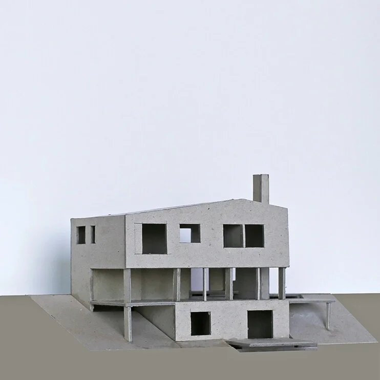
Below are a couple more houses we have designed that include covered outdoor spaces. The first is a house in Devon that has a tall loggia at one end, somewhere between the scale of a room and a barn. On a steeply sloping site it provides a level space for outdoor entertaining and play, connected to both the kitchen and the garden.
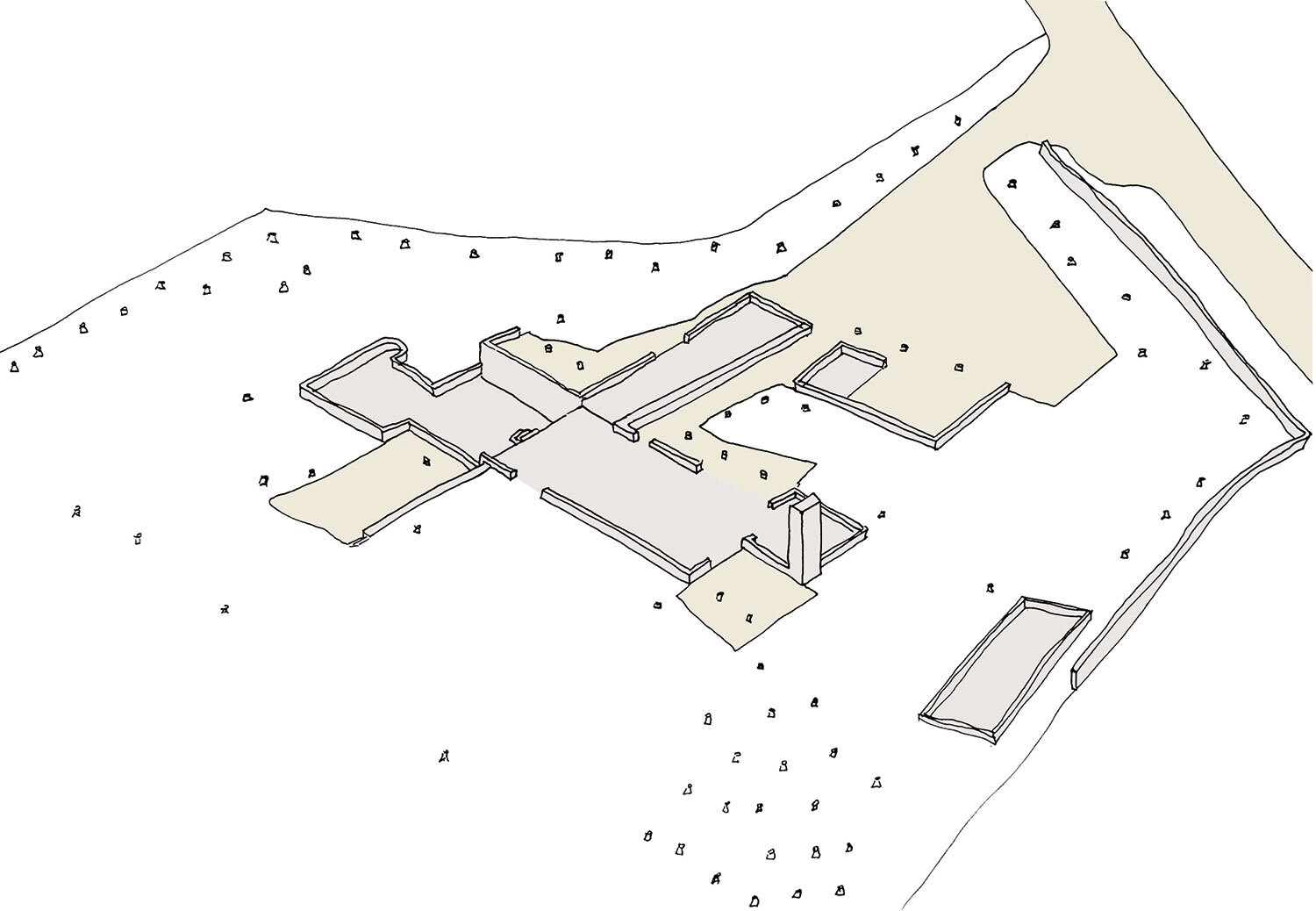
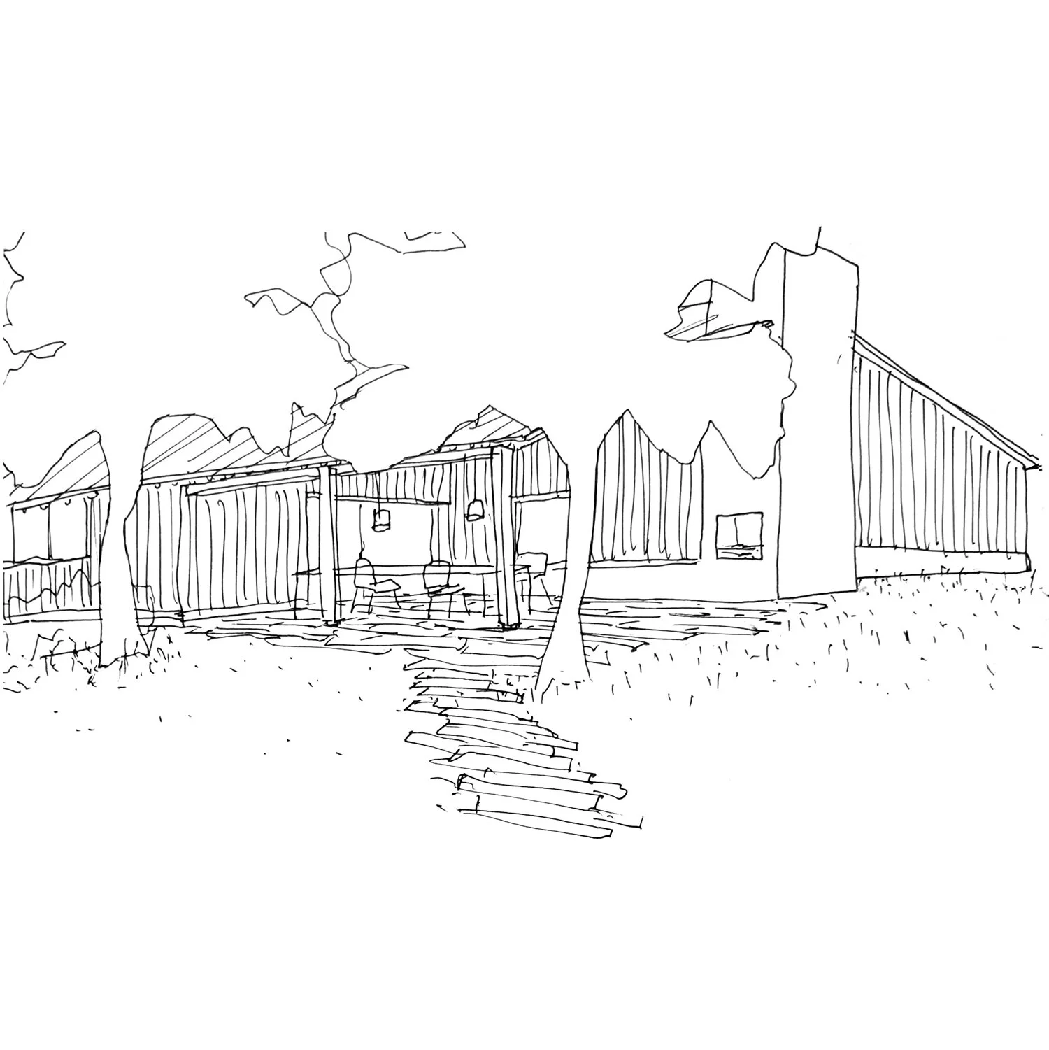
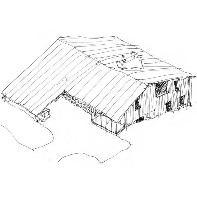
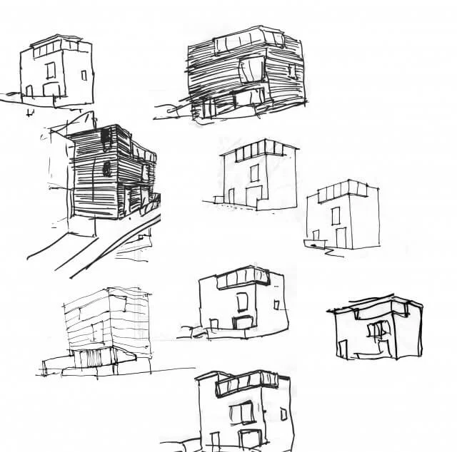
The next is a house in Somerset, currently at detailed design stage. Our clients want to live on one level, so the house is composed of single storey, pitched-roof forms that step down as the land falls away to the garden. We started off working around a taller, more compact house, and sheltered outdoor spaces were part of the design from the beginning. A carport, games room and annex define a sheltered entrance courtyard that provides the reception rooms a southerly aspect while shielding them from the noise of the road and railway to the south. In a number of places the roof projects beyond the walls to form ‘intermediate territories’ between inside and outside that blur the distinction between the house and the landscape.
Early 2 storey ideas
Plan showing internal spaces in grey and intermediate territories in beige
Loggia for outdoor dining
View from dining area through veranda to courtyard
Verandas are ubiquitous on buildings made by colonial settlers from Europe wherever they went. In hot climates they keep the sun off the walls and allow doors to be left open when it is raining, so keeping the house cool. The images below are of a Estancia las Carreras in Argentina, built by Jesuit missionaries in 1718 and now a hotel (highly recommended if you are going). The rooms are arranged around two courtyards with verandas on all sides like a cloister. As well as providing circulation the verandas are wide enough to sit out under, so each room has both a window out to the landscape and a door onto a sheltered, shared courtyard.
An urban example below, also from Argentina, is the Casa de los Ezeiza, a mansion built in 1876 and which has proved amazingly adaptable to other uses. The rooms open directly on to three patios, with a covered walkway providing shelter from the rain and summer sun. Reception rooms opened off the first courtyard, bedrooms off the second and the third was for service functions. The relationship between the open space, the covered circulation and the cellular rooms is totally interdependent - one would not function without the other.
The family moved out after only a few years following a yellow fever epidemic, after which the house became a primary school and then the headquarters of the Institute for Deafness. By 1930 it had become a conventillo, a shared house for over 30 families, mainly immigrants, crammed into the rooms and transforming the gentile patios into teeming communal yards. In the 1980s it was renovated and became an antiques market.
This post is one of a series that look at ideas that drive our design process. Using examples of buildings from the past and from our own work, these posts are intended to explain the way we think and to encourage discussion. See below for more related posts.


