I recently spent 3 days in Marseille on our annual study trip with the 3rd year architecture students at Bath University. Marseille is a city where Modern architecture feels at home, where it sits comfortably in the landscape. Seeing how the tower blocks stand against the dramatic bluffs behind and within the city, it is easy to be seduced by their sculptural qualities in the way the original Modernists were by the industrial structures that inspired them.
The Unité d'habitation was looking magnificent in the winter sun, and it was great to see children playing on the roof as intended. I won't talk about that here as it is well documented elsewhere. I'd recommend going to see Appartement No. 50 for which its owner commissions a different designer to carry out interventions each year. It is a south-facing flat on the narrow end, so a different arrangement to the apartment I've stayed in on previous visits, and the owner says it is actually cooler than the east-west oriented apartments because the sun is higher on the south side, so the brise soleil work better.
Christian Haid suggests on his blog Synchronicity, that the fact social tensions are less in Marseille than in other French cities might be partly due to the distribution of housing estates (grandes ensembles) throughout the city rather than in ghettos on the periphery, and furthermore that they are not surrounded by ill-defined. poorly maintained pseudo-public space and hence the residents are better integrated in the city fabric. So while it might work for private housing where residents pay sufficient service charges to maintain the surrounding space, the 'block in a park' typology promulgated by the Unité d'habitation is perhaps the wrong model for social housing.
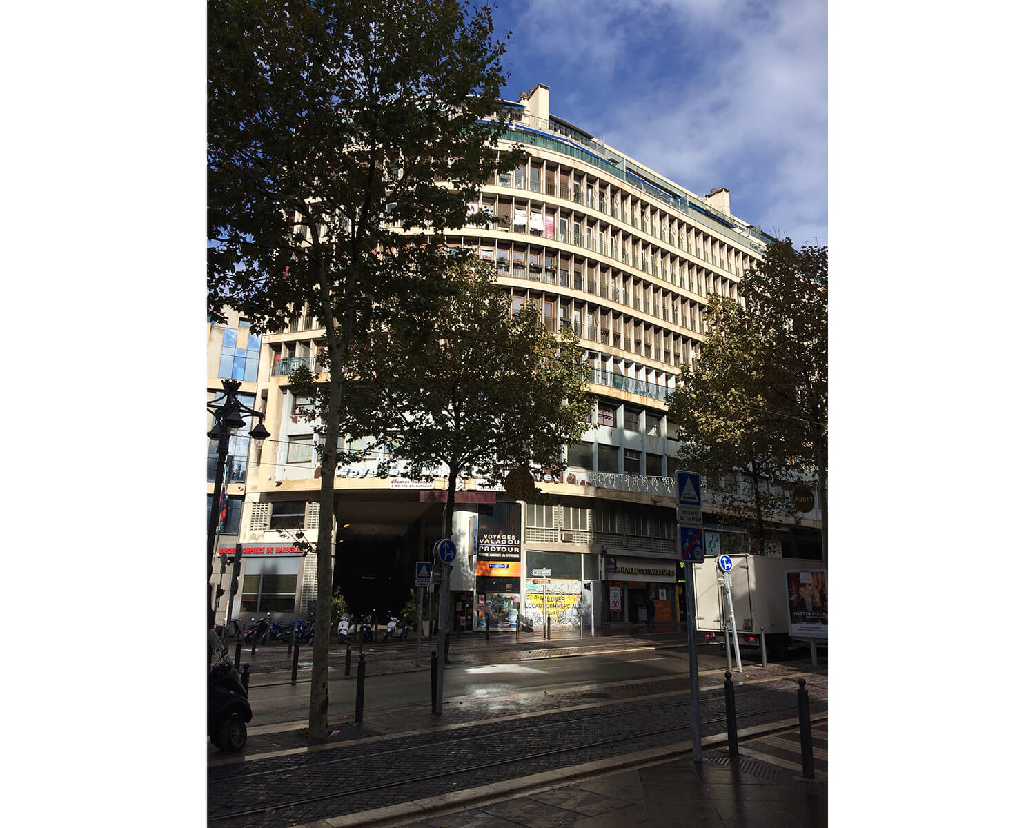
Although their forms sit well in their contexts, few of these blocks have active ground floors, so although it may benefit the residents being closely connected to the surrounding urban fabric, the buildings could offer more to the streets they land in. The service areas required don't leave much room for other functions on the ground floor, but even a single shop unit would have helped the example below on the Cours Belsunce.
I like how the main facade of this block on the Rue des Catalans inflects to address the bend in the road and the beach in front. The two solid vertical elements on the corners and the asymmetrical roofscape stop it feeling squat.
One of the odd things about Marseille is how unaware you are much of the time of the sea. The street pattern is irregular, so there are no glimpses of it at the end of the streets and you can only see it from tall buildings, framed in the distance by rooftops and chimneys. I'm putting the Vieux Port down as a marina, so that doesn't count. The closest place to get down to the actual sea is only 20 minutes walk from the centre at the Plage des Catalans, a rocky cove that must be packed with sun-seekers in the summer, but was deserted and wonderfully refreshing early on a November morning when I was there. On an outcrop at one end of the beach is this swimming pool complex, Le Cercle des Nageurs (1960-69) by Atelier 9 architects.
Walking further south along the beginning of the Corniche I found some wonderful restaurants clinging to the rocks like crustaceans. I'd love to survey them and know more about their history but can't find anything on-line. Although designed with few aesthetic pretensions, and sometimes crudely built, these little clusters of shacks, terraces and canopies seem quite in harmony with their setting and the elements. There is nothing to suggest the involvement of architects, and they seem to have evolved over a number of years of incremental building work. Modern materials have been used in the most functional and practical ways, the structure and civil engineering determining the form and character of the buildings in a way that suggests an unconscious acceptance of Modernist principles.
I would describe these structures as a Modern Vernacular, an architecture that has arisen from the response of individual builders to a particular place using the most efficient means available to them. I would like to design buildings in this way.
Above: Bains de Mer du Petit Pavillon
Below: Le Bistrot Plage
Back in the city centre I sought out the work of the architect Fernand Pouillon. He was a local architect who designed a number of buildings around the city, but is best known for his work as head of reconstruction of the Edge of the Panier facing the Vieux Port after the Second World War. He managed to realise buildings of great presence and tectonic clarity on low budgets, partly by being the contractor as well as the architect, a practise that was illegal in France and landed him in prison in the early 1960s.
Below is La Bibliothèque Saint-Charles (1956-58), a university library shaded by a beautifully proportioned colonnade on the south side and raised up on a plinth like a temple. Although clad in stone externally, its structure and interior are quite prosaic, relying on its scale and classical proportions for its spatial qualities.
The building below is the L'immeuble des Nouvelles Galeries (1950-52, Fernand Pouillon & Rene Egger) on La Canebière, which has shops at ground floor with a carpark behind, offices on the next floor and apartments above accessed via a pair of symmetrical spiral staircases wrapping around the lift shafts. The flats appear to be only single aspect and the 2 internal courtyards were looking rather shabby.
Pouillon's most impressive work is on the north side of the Vieux Port where he was charged with re-building the portion of the Panier that was dynamited by the Nazis trying to root out the French resistance in World War II. Most of the buildings on the north side of the port behind the masts in the image below were designed by Pouillon, including the tower on the left which is part of the La Tourette complex. The massive piers of the apartment blocks were built using flush-jointed solid stones as permanent formwork for a concrete frame.
For more on Fernand Pouillon see here, and see Adam Kahns's article in Building Design on the buildings around the Vieux Port.
Above: Arcade on the Quai du Port (1946-55 - Fernand Pouillon)
Below: Cloister of La Vieille Charité higher up in the Panier (1671-1749 - Pierre Puget)
Overlooking the Vieux Port further east is the magnificent Hotel La Residence (1949-52) by André Jacques Dunoyer de Segonzac, who also designed the Basilica of Higuey in the Dominican Republic. The elevation is more Modern than Pouillon's work, beginning as a composition of openings in a wall at low level and the frame becoming more expressed towards the attic storey at the top. I particularly like the way the elevation is cranked in the middle. The road in front bends slightly in front of the hotel and the change of direction could have occurred between two buildings but the architect saw the opportunity to claim it for his building, making it feel more important but also more welcoming.


