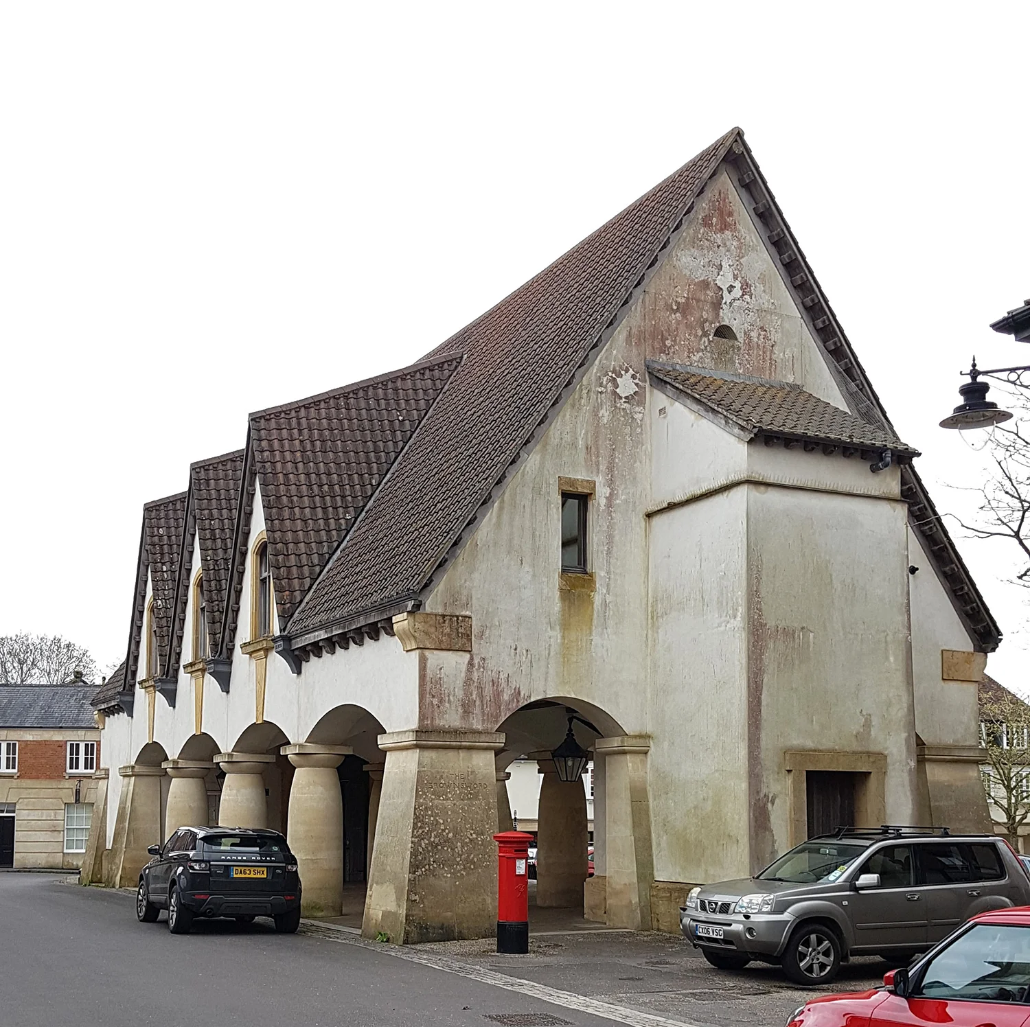
I can think of times when I have entered a room and experienced a feeling that is almost physical, not the product of intellectual analysis but something visceral and immediate. Such experiences don’t happen often and they are unpredictable. I might have been excited about visiting a building which in the flesh felt a bit flat, or have gone somewhere with modest expectations only to be deeply moved. What is it that provokes this effect, and how can a designer conjure such an emotional response?
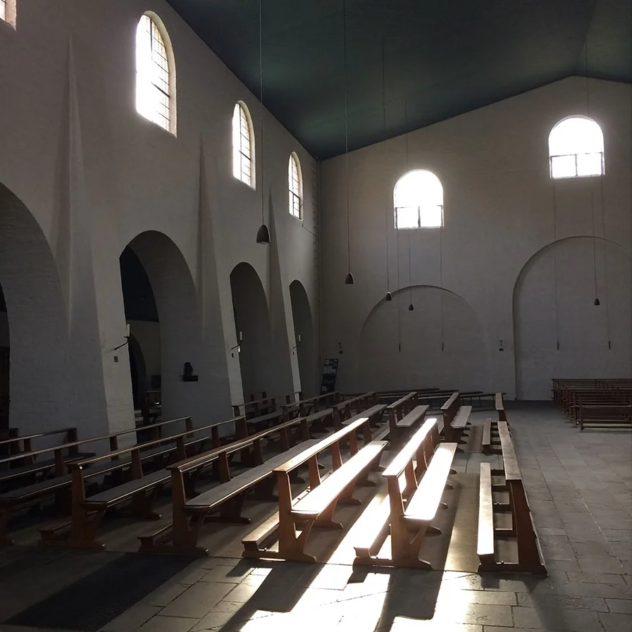
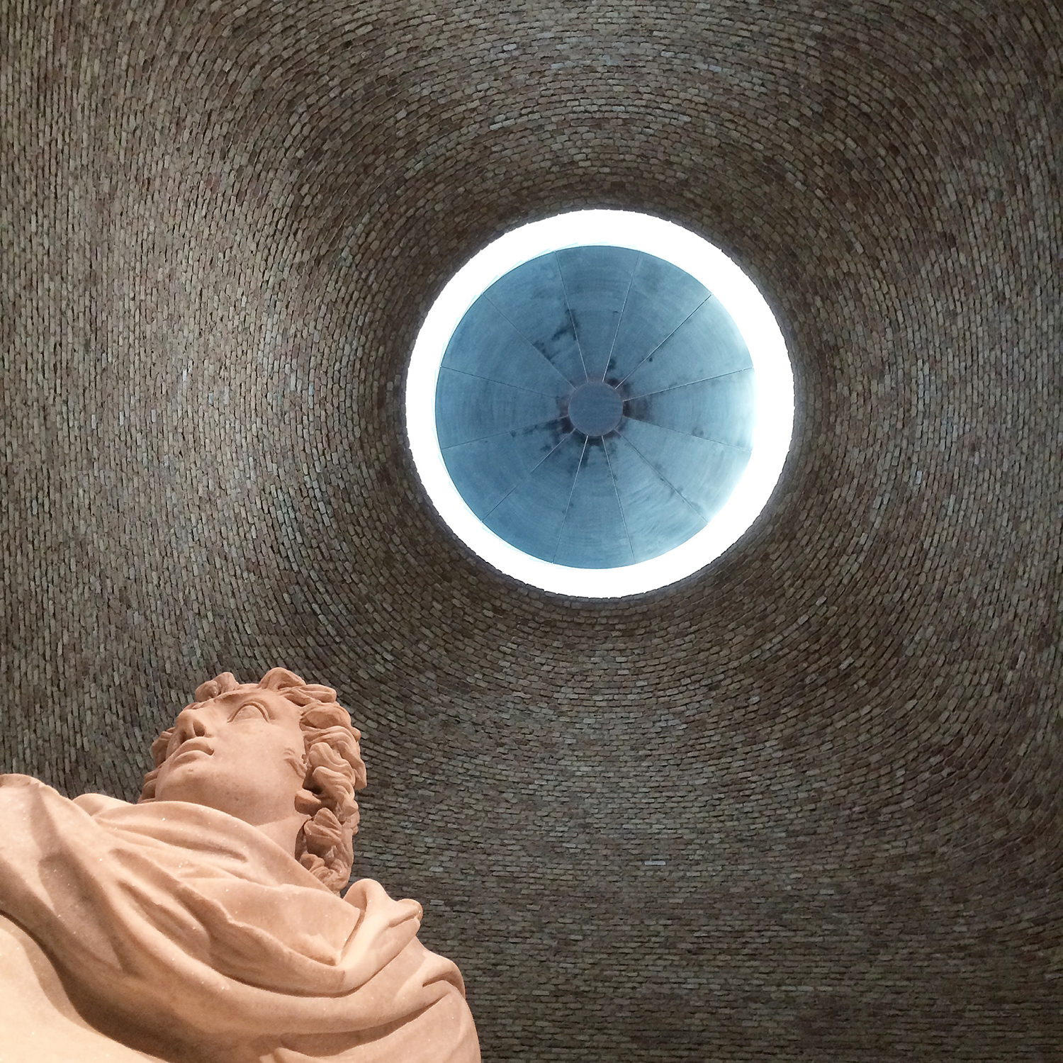
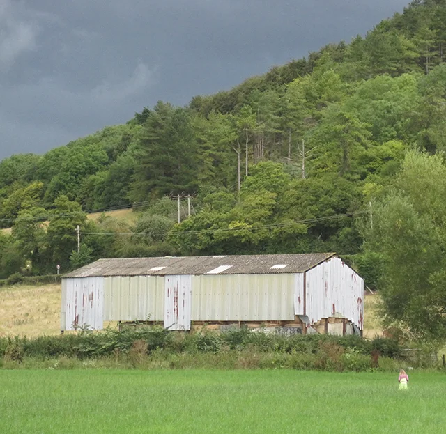
The image above shows a dark space with four openings onto smaller cellular spaces. The smaller spaces are lit by high windows, deliberately out of the field of vision from the main space. The cells seem to glow as if the whole aedicule is the light source. There are no windows in the larger space, so its inner surfaces are very dark, a total contrast with the cells. The walls have been painted with a thick slurry that subjugates the character of the individual bricks to the wall as a whole, their colours and variation reduced to a texture, softening and diffusing the light. At the threshold there is a change of level, so you have to consciously step up into the cells. The thickness of the separating wall expresses a sense of weight and enclosure. The experience is one of moving through a physical environment of solid masses of material, between light and shadow.

Turning away from the windows our eyes adjust to the darkness and subtle colours emerge. The central brick piers are painted a different colour to the smoother soffits. The grey limestone floor and altar have a blueish tinge that is picked up and accentuated by the painted timber seats. Brown woven matts are placed beneath the seats where sandalled feet would otherwise touch the cold stone when kneeling. All these elements seem to work in harmony with one another – there is nothing jarring or out of place. The space could be said to have a tone, a uniting harmony to which all the components adhere and contribute.
The room in these images is the crypt of the St. Benedictusberg Abbey at Vaals in the Netherlands, designed by Dom Hans Van der Laan, whose work is based on strict mathematical ratios and proportions, and an almost primeval approach to tectonics and form. I had wanted to visit since learning about it as a student and thought it was probably going to be rather dry, but when I went into both the crypt and the church above, found them to be incredibly moving and atmospheric spaces.
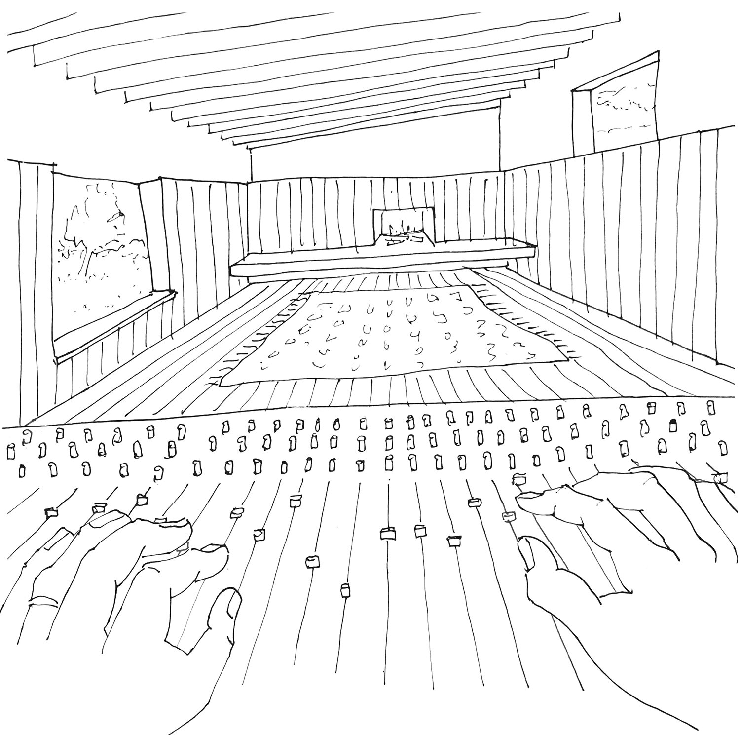
I have tried to unpick some of the elements that contribute to the overall feeling of the space. The visitor can just enjoy the experience but the designer needs to analyse, understand and learn to manipulate the variables over which they have control in order to create the effect they want to achieve. It is a delicate balance – one false move can upset the whole composition. The process is analogous to that of a record producer working with a mixing desk, adjusting the levels and tweaking the balance of the sound.

This beautiful room is in the Pension Briol in the Sud-Tyrol, the German speaking part of northern Italy. We arrived here in the evening after a whole day of travelling. Coming in out of the dark we were handed a schnaps and whisked into this dining room where the host was serving a home cooked meal of local produce and old family recipes. It is simply furnished with rustic wooden tables and chairs, made in the 1920s when the guest house was remodelled in its current form.
There is something incredibly warming and enveloping about a wooden room, but there is nothing architecturally complex about it. It is a simple rectangle in plan, with a central door at either end and some windows on one side. There is a picture rail, above which the walls and ceiling are plastered and painted white, and below which they are panelled in timber. The panelling is just knotty pine, the timber found growing nearby and used in ordinary buildings. The only detail that stands out is the swag over the door containing the initials of the owner. These slight classical hints lend it an air of sophistication without eroding its essentially rustic character. The atmosphere could so easily be spoiled by a different paint colour, inappropriate light fittings, different chairs, patterned table cloths or uninspiring art on the walls. A crucial part of design is resisting the temptation to over-complicate and knowing when to stop.


Here is another place where I had a similar visceral experience, Kettle’s Yard, the Cambridge home created by Jim Eade, once a curator at the Tate Gallery, between 1956 and 1973. The house is made up of four terraced houses that have been connected, creating a sequence of different sized rooms with a simple palette of wooden floors and white plaster walls. Ede’s art collection takes centre stage, and the pieces are all quite small, perfectly suited to the intimate domestic interior. The quality of the art and the quirky way it is displayed are immediately engaging, but equally importantly, the character of the spaces comes from the intrinsic qualities of the building, and the simple choices of finishes that are in harmony with the building fabric. Each room is different due to its proportions, shape and the size and position of the windows, but they are closely bound together by the palette. There are no shiny surfaces, The whole house has a distinct tone that is appropriate and very particular to the building, the contents and the people who created it.
Buildings I admire tend to have a consistent uniting tone, a character that pervades the whole environment, achieved through deliberate and precise control of light, materials, colour, texture and scale. I like the word tone because it suggests both visual and aural sensations, a reminder that the feeling of a place is perceived through all the senses, not just what we see.