While in the midst of my first self-build project, the Newington Green House, I met my wife Emily. We ended up living there together for 8 years without her having had much say in the design of it. It was something of a bachelor pad, and we had little money for furnishings or linings that might soften the concrete ground floor and bare brick walls. From our early days we talked about designing a house together and after a few years we were thinking seriously about moving to the country. We spent several years following the property auctions, going to see potential sites and getting the lay of the land, but we couldn’t afford to buy anything without selling our London house. In the meantime we spent long hours discussing what we might want a country house to be like and developing a sense of its essential character.
Rather than thinking about what it would look like, a lot of our discussions revolved around the atmosphere of the house and the way different spaces would relate to one another. Emily is an interior designer, so we each had different, but fortunately complimentary views of the process. We agreed that the atmosphere, or character of the house is the fundamental vision that underpins all future decisions. The hundreds of choices that have to be made in designing a house can be overwhelming and without a clear aim the result can easily end up being no more than the sum of its parts.
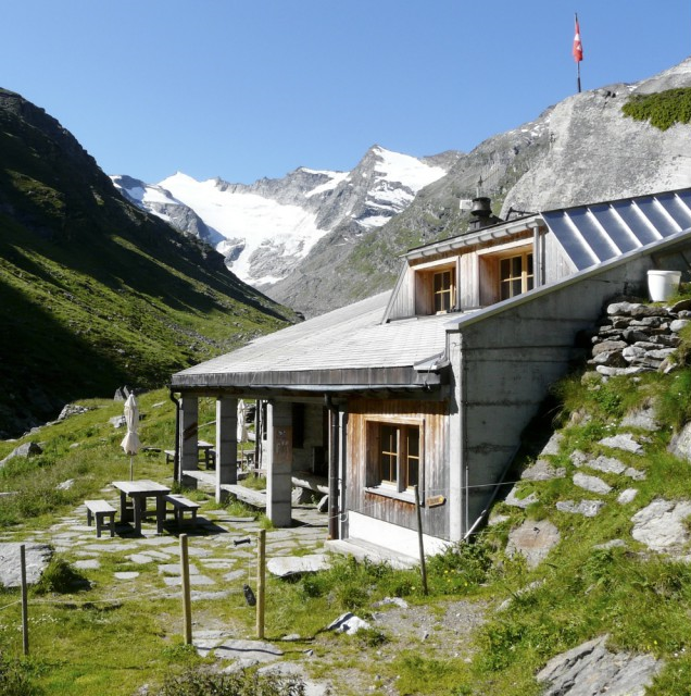
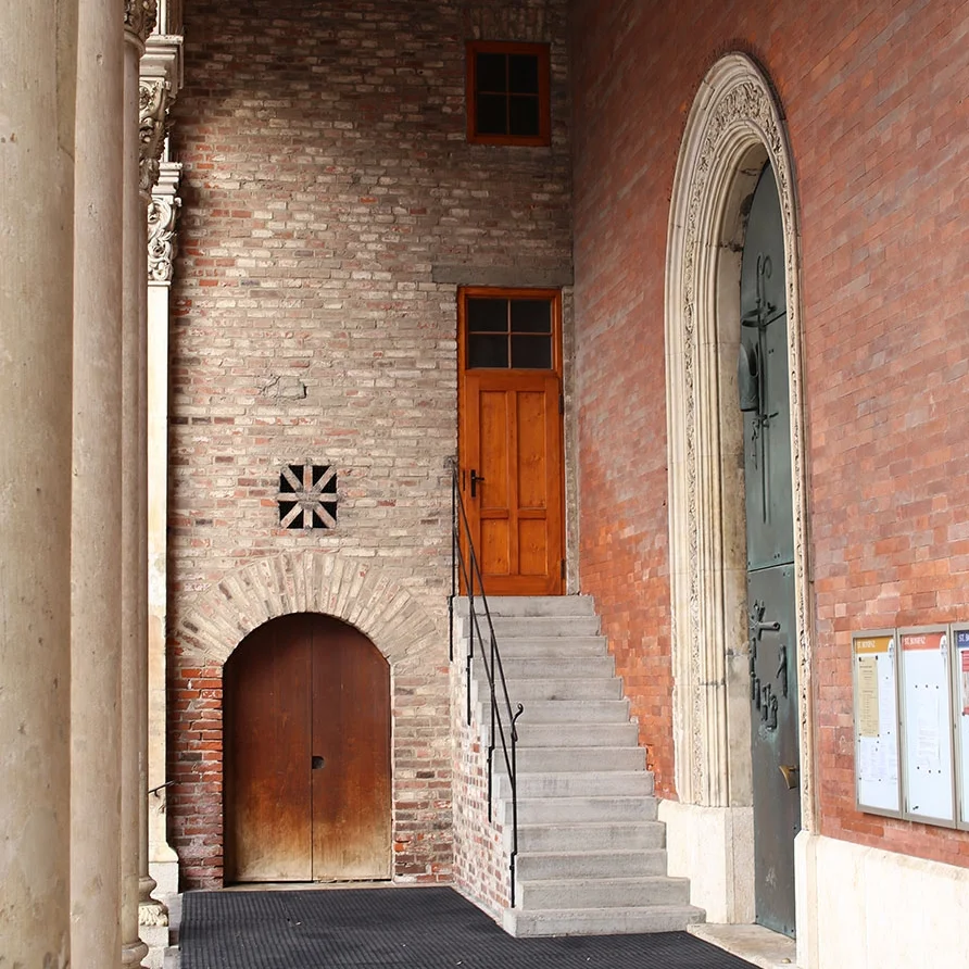
We talked a lot about rooms we like and tried to analyse what it is about them that makes them attractive. A room I particularly have in mind is in a mountain refuge we came upon above Vals in Switzerland. We had been walking all morning and the weather was closing in. We found the refuge tucked into the hillside, its physical relationship to the landscape communicating shelter and protection, with a generous front porch where boots can be removed out of the rain (photo above). Inside, we came into a timber-lined room with small windows and a wood-burning stove, and from the kitchen appeared a humble but memorable meal of homemade cured sausages, cheese and dried fruit. It was a simple space made from everyday materials, and it isn’t an old building, but it exuded a feeling of warmth, welcome and sanctuary. I don’t have a photo of the room but it stuck in our minds as having the feeling we would want a snug to have in our future house.
Below is another room we like, the dining room at the Pension Briol in Sud-Tirol in norther Italy. Again it is timber lined, but a bit more refined than the refuge. The garden is visible enough that you feel a strong connection to the landscape but not so much that the feel of containment is lost. The same pine timber is used for the wall panelling, window frames, floor and simple furniture. We arrived in the evening, were handed a schnaps and sat down to a wonderful dinner of home-cooked Tyrolean food. I confess it was partly the food that made it memorable, but that is an important point. The atmosphere of a room, or house comes from the way the building fabric harmonises with the passions and personalities of its inhabitants.
We study precedents for several reasons. They can provide inspiration, take us in a direction we hadn’t considered, or offer an analogous solution to the problem with which we are grappling. A precedent might be chosen for aesthetic reasons, but more usually I find I am drawn to buildings that evoke a particular feeling, or address a certain condition or pattern of use. I am trying to understand the way a space is used, how it engenders interactions and how people might feel when they are there.
The site we found is on a south-facing slope overlooking the Somerset levels. The view is expansive but the qualities of the levels are quite subtle and we found the landscape features could be made more apparent by framing views in particular directions. We had already decided we didn’t want huge continuous areas of glass because they are dark at night and don’t provide the sense of enclosure you get from solid walls. By making specific openings sized to suit the function of the room and the view, each room gains its own specific character from its sense of enclosure and relationship to outside.
The image above is the Khuner Country House in Austria by Adolf Loos (1930). Loos developed the concept of the ‘Raumplan‘, where the dimensions of each interior space, and its connections to neighbouring spaces are conceived specifically around its functions and the atmosphere he wanted to create. As well as the spatial volume he considered lighting, linings, texture, pattern, colour and furnishings, which work together to give the room its atmosphere. We took a similar approach in designing our house, sketching and modelling each room to fine tune the height, materials, openings and connections to adjoining rooms.
Upstairs, the underside of the pitched roof is exposed so the ceiling height in each space varies. The snug is located at the eaves and there are 2 steps up into it to give it a lower ceiling than the main kitchen-dining space from which it is entered. The entrance hall also has a low ceiling which rises as you move through into the kitchen-dining space.
The external cladding and structure of the house are timber and we felt strongly that it should not turn into a plasterboard house on the inside. A timber-framed building inherently requires lining for structural integrity and fire protection. We used Fermacel as the internal lining for fire protection, but all the rooms have an additional timber lining on top which we have used to adjust the scale and atmosphere of each space. The entrance hall, reception spaces upstairs and the master bedroom dressing area are lined full-height with oak boards that match the floors. Elsewhere the walls are lined with painted plywood up to a height of 2.2m. Downstairs the ceiling height is even, except the master bedroom which was located below the snug to allow it to benefit from the additional height. The 3 downstairs bedrooms have exposed ceiling joists to give them a sense of structure and differentiate them from the hallway and utility spaces.
After several months of design we had arrived at a 2 story house dug into the hillside, with a compact, roughly square plan and an overhanging roof, both desirable features in a Passivhaus. The siting of the house felt right and the internal planning was quite resolved but something was missing. It didn’t feel like a piece of architecture. As we came down to Somerset more I started to notice a type of barn that bore striking similarities to our house design.
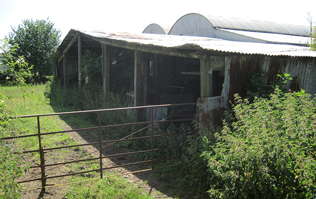
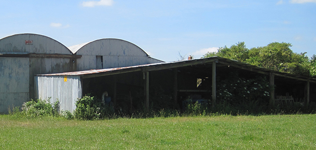
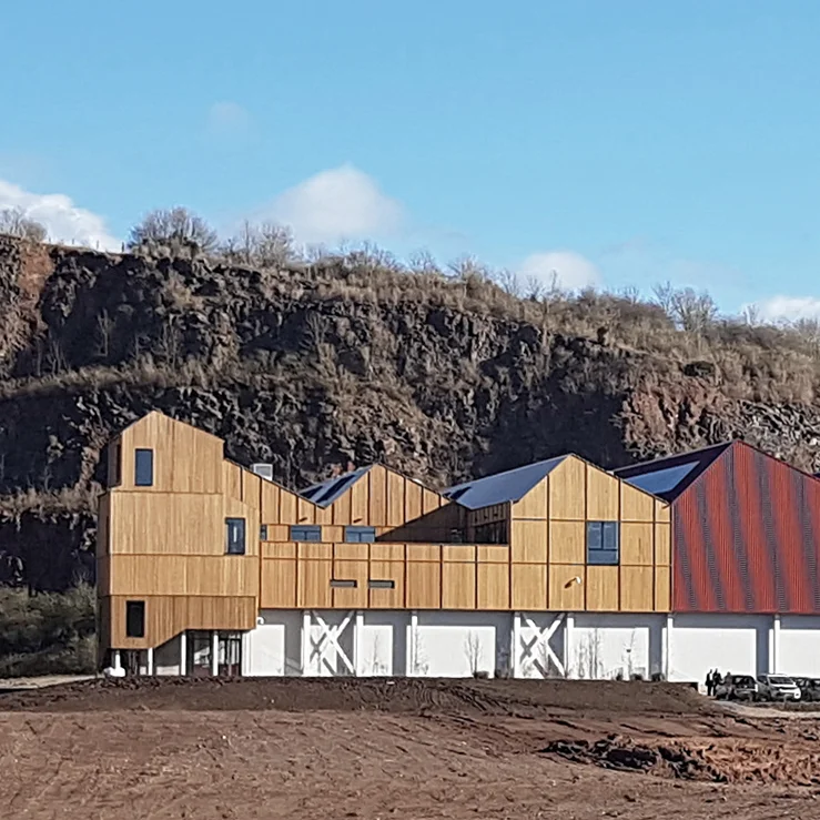
The barn above is in Somerton. It has a timber structure with corrugated steel cladding on its two short ends, but the exposed long side is open, revealing the structure. I like the contrast between the robust timber posts and beams, and the thinness of the roof and cladding. Buildings I like tend to tell some sort of story about their structure, about how they are made and our design wasn’t doing that. By adding a line of posts around the edge of the overhanging roof the house gains a visible structure.
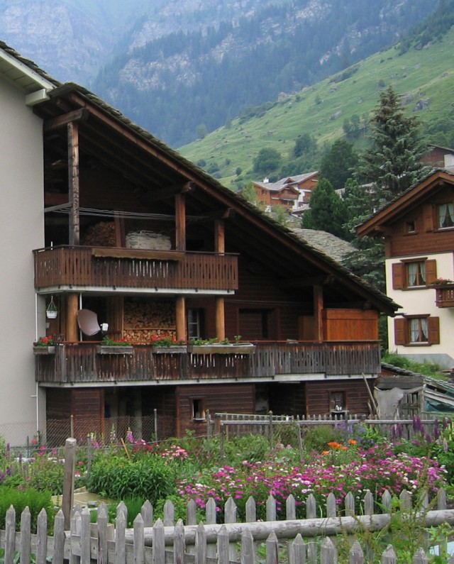
As well as holding the roof up, the posts create a feeling of enclosure to the outside verandas and frame views out to the landscape. The roof keeps the rain off but also creates a micro-climate, extending the season when we can be outside. Back in the Alps, roofs often project beyond the building envelope to shelter various activities. The example below has spaces for eating outside, for drying washing, for keeping firewood and storage.
Another influence on the design of our house was the verandas found in colonial architecture. The example above is in San Lorenzo, Argentina but I have seen similar verandas in India, Africa south-east Asia and north America. Importing a feature typical of tropical architecture may not seem relevant to the British climate where we are grateful for any sun we can get, but a Passivhaus requires solar shading to prevent over-heating and the veranda provides this, along with the an entrance porch, places to eat or play outside, for drying washing, for wood storage and a carport. The loggia outside our kitchen door faces south-east so it catches the morning sun while being sheltered from the prevailing wind. It often feels several degrees warmer here that elsewhere around the house.
But we had to be careful it didn’t end up like this:
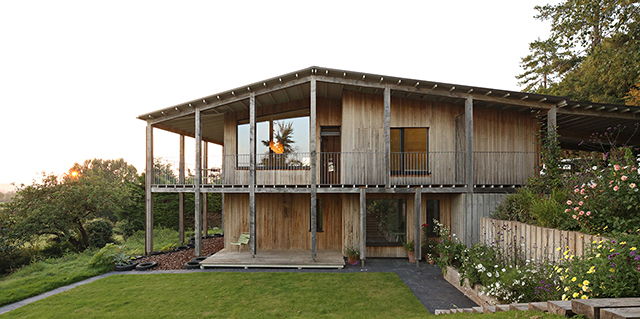
Above is the final model of the Dundon Passivhaus with a green oak out-rigger structure on the south-west, south-east and north-east sides. There is no roof overhang on the north-west side where there is no need for shading or sheltered outdoor space.
Exploring a wide range of precedents allowed us to find ideas that were appropriate to our house, but only by analysing them carefully and extracting the essence of those ideas were we able to use them to create something original.

