This is a post from out Tuscany trip last summer that I started but only just got round to finishing. I have long been intrigued by the work of Giovanni Michelucci, an architect from Pistoia who’s early work such as Santa Maria Novella railway station in Florence was rational and functional but who later developed a much more expressive approach rooted in a knowledge of vernacular architecture, history and the way people use the urban environment. He aimed to make architecture that was ‘born from the observation of everyday life. From great historical processes that come from the small things which relate to the psychological habits of the particular, natural, social, and physical circumstances.’
From the distance of studying 2-dimensional images in another country his work can seem over-complicated and self-indulgent. It is obviously inventive and spatially dramatic but is the overall effect greater than the sum of its parts? I only had time to visit two buildings, the Banca del Monte dei Paschi di Siena in the town of Colle val d’Elsa and his best known work the church of the Autostrada del Sole just outside Florence.
The Bank building in Colle val d’Elsa was designed & built between 1973 and 1983. It consists of a steel framework which cradles a number of Portacabin-like metal-clad boxes containing offices and public banking rooms. The most striking feature is that the building is raised above the ground on a red painted steel structure that shelters a Travertine paved public space at ground floor level which is further defined by several stone volumes that provide access up to the offices above. Michelucci envisaged this space as a market place, linking to the wider urban fabric by providing routes between nearby streets. Above the ground the movement of people on the stairs and walkways is intended to extend the visible activity in 3 dimensions, transforming the structure into a framework of inhabited space. The prioritisation of community benefit over the (arguably) best interests of his client to have an easily accessible banking hall is striking. When I was there it was admittedly raining but only one or two people crossed the square. Nevertheless the desire to create a piece of townscape rather than a mono-functional, private building is inspiring in our age of security and corporate control of the public realm.
The idea of the structure, or armature as a separate entity from the enclosed volumes it supports was a major preoccupation in the 1970s as designers became aware that the speed of technological advance meant that some elements of buildings might become redundant before the structure has reached the end of its life. A building within which the mechanical services, environmental controls and interior fit-out might be replaced by lifting out the entire inhabited volumes as a series of containers or pods is a seductive idea and one that still pops up regularly in student projects. Few buildings were actually built in this way though and those that were built usually haven’t ended up being modified in the manner intended by the designers. Cedric Price’s Interaction Centre in Kentish Town (1971) for example was demolished rather than being adapted to current needs and the Centre Pompidou in Paris (1977), while hugely successful as a tourist attraction and civic symbol, has functioned more as a static building than the adaptable framework originally envisaged. The main reasons are that the maintenance costs for a building with so many external surfaces and a complex external envelope are high, that the cost of replacing large elements can be as much as replacing the whole building, and particularly that the needs of the users often change more significantly than can be accommodated in the original structure.
I don’t know how well the Michelucci building suits the current needs of the bank in Colle val d’Elsa but it is certainly well maintained and makes a unique public space in an otherwise unremarkable area of the town.
50km away on the northwest side of Florence is the San Giovanni Battista church on the Autostrada del Sole. It was built between 1960 and 1963 in memory of the workers who died during the construction of the A1 motorway that connects Milan and Naples and it sits immediately next to the motorway. The swooping copper roof forms are visible from a long way away on the motorway but getting there involves a convoluted journey through the glamorous industrial estates of Firenze nord.
There isn’t much published about Michelucci in English but this dissertation by James Taylor gives an excellent description of the church and Michelucci’s wider career.
With no strong topography or urban grain to relate to Michelucci has made a self-contained composition of dynamic routes, structure, materials and form. The restless relationships are intended to encourage movement around the building and to capture the dynamic flux of life. From the outside a mostly single storey stone wall defines the perimeter of the building in plan. Concrete elements of structure emerge out of the stone in places to make wider spans but neither could be called dominant. Made up of a number of shifting planes and plunging curves the roof is the most powerful element but it doesn’t oversail the walls. Where they meet, the copper is folded over the top of the walls showing the thinness of the metal finish and sometimes the pitched roofs disappear behind the wall. Michelucci is more interested in expressing the qualities of the different materials and the way they are put together rather than in a play of geometric forms so the building always reads as a constructed assembly of materials and rather than an abstract composition.
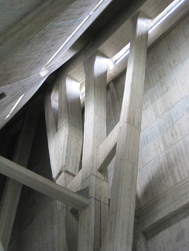
Inside the palette is almost entirely stone and concrete except for metalwork balustrades, bronze doors and window frames. There is no timber although the carpenters’ labour is intensely expressed in the board-marked concrete structural elements. I particularly like the marble floor where the joints were specifically developed to be as visible as possible yet perfectly smooth. The pattern of joints swirls around the building and, like the roof, avoids focusing towards the alter and instead reinforces the flow of space. The nave is magnificent, the roof soaring up to a shadowy apex and swooping down again to form a series of intimate spaces that flow seamlessly together in a continuous spatial experience.
The most problematic thing for me is the complexity of the concrete columns so close to the curved concrete roof vaults of the main nave. The analogy is that of a tent with the central poles supporting a hanging fabric roof but there is slightly too much going on and the space feels cluttered. There is a sense of structural redundancy, or rather that a simpler solution might have been found which did the job more elegantly.
Despite my misgivings I still think its a great building although not quite up there with the chapel at Ronchamp by Le Corbusier (1950-54) and the two churches by Sigurd Lewerentz at Björkhagen (1956-60) and at Klippan (1963-66).


